Product.me is a next-generation SaaS platform built to help retail businesses run more efficiently, communicate clearly, and deliver stronger customer experiences. When they approached us, their brand and supporting assets weren’t aligned with the quality or ambition of the platform. Their visual identity lacked structure, consistency, and clarity. The website design wasn’t communicating their value effectively. Their sales materials weren’t strong enough to help them compete in a crowded retail technology sector.
Our role was to rebuild their brand from the ground up and create a system that would support their growth. This meant tightening their visual identity, delivering proper brand guidelines, redesigning their digital presence, and producing high-quality sales and marketing materials that reflected the credibility of a modern SaaS provider.
We focused on creating a unified brand ecosystem that could scale across print, digital, presentations, product documentation, and motion. Every asset needed to reinforce trust, clarity, and professionalism, which are essential to any SaaS or retail management platform trying to reduce friction and win customer confidence.


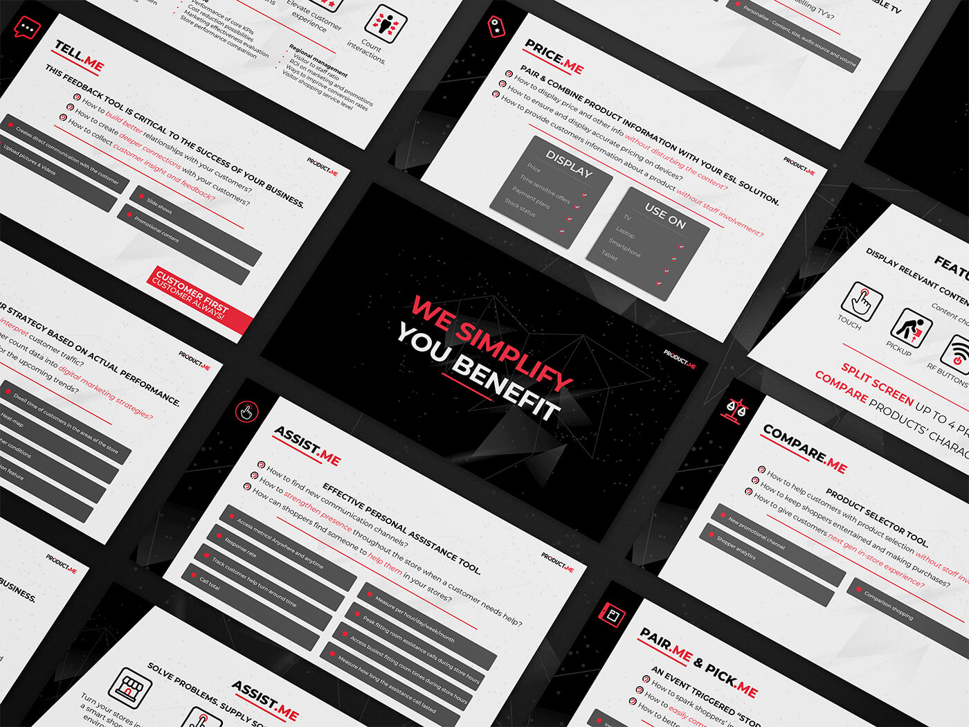
The first phase was to completely overhaul the brand. Their existing identity had fundamental issues with spacing, colour usage, layout, contrast, and hierarchy. We corrected these faults and established a refined visual system that was consistent, flexible, and aligned with the expectations of the retail technology sector. The brand guidelines covered typography, colour palettes, spacing rules, grids, iconography, and layout principles, providing the internal team with a proper foundation for future growth.
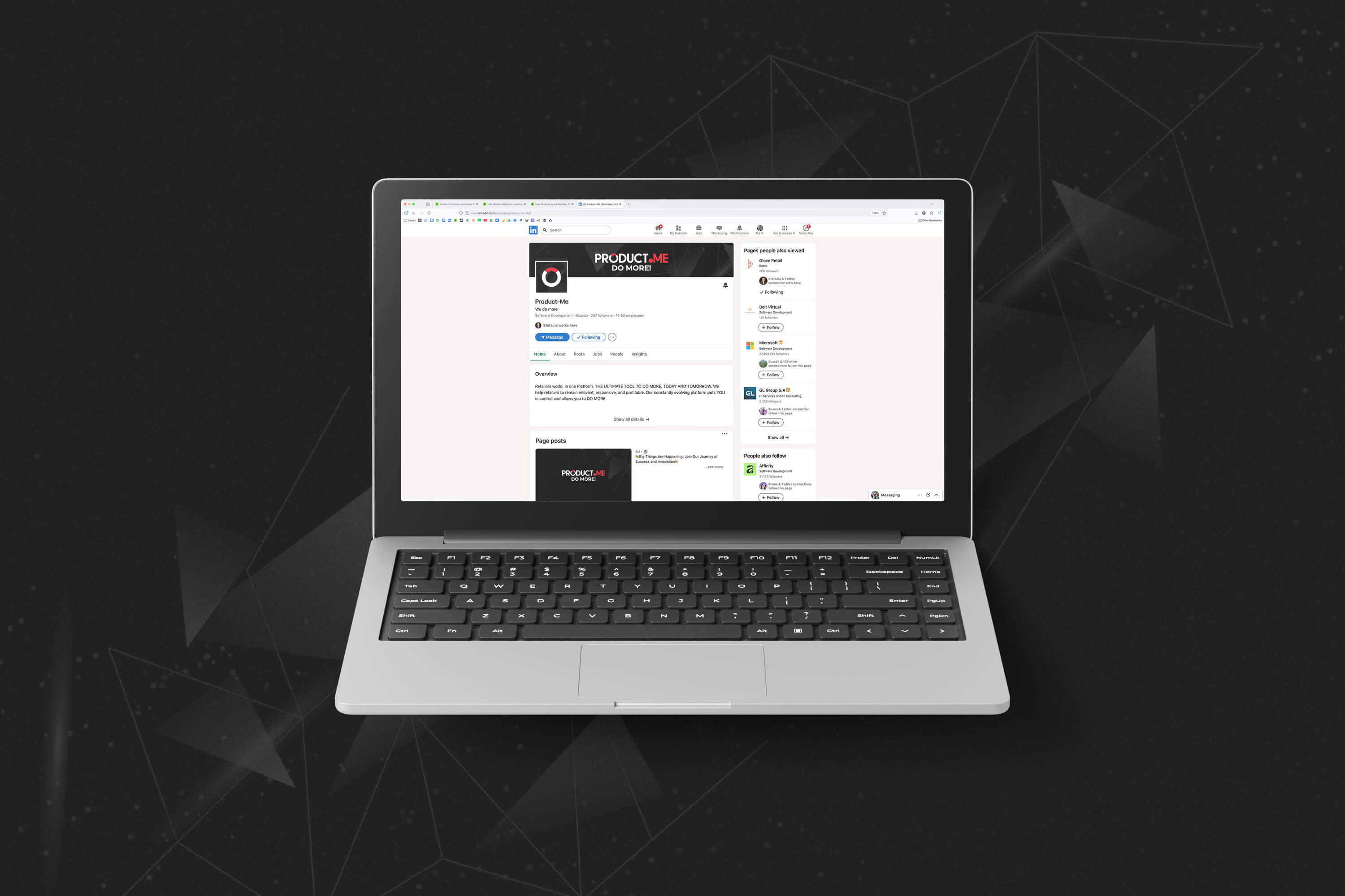
From there, we expanded the identity into practical brand assets. We produced new business card artwork, letterheads, and social media collateral, ensuring that every outward-facing touchpoint matched the refreshed identity. We also designed a complete custom icon set, giving the platform its own visual language across UI, website, and presentations.
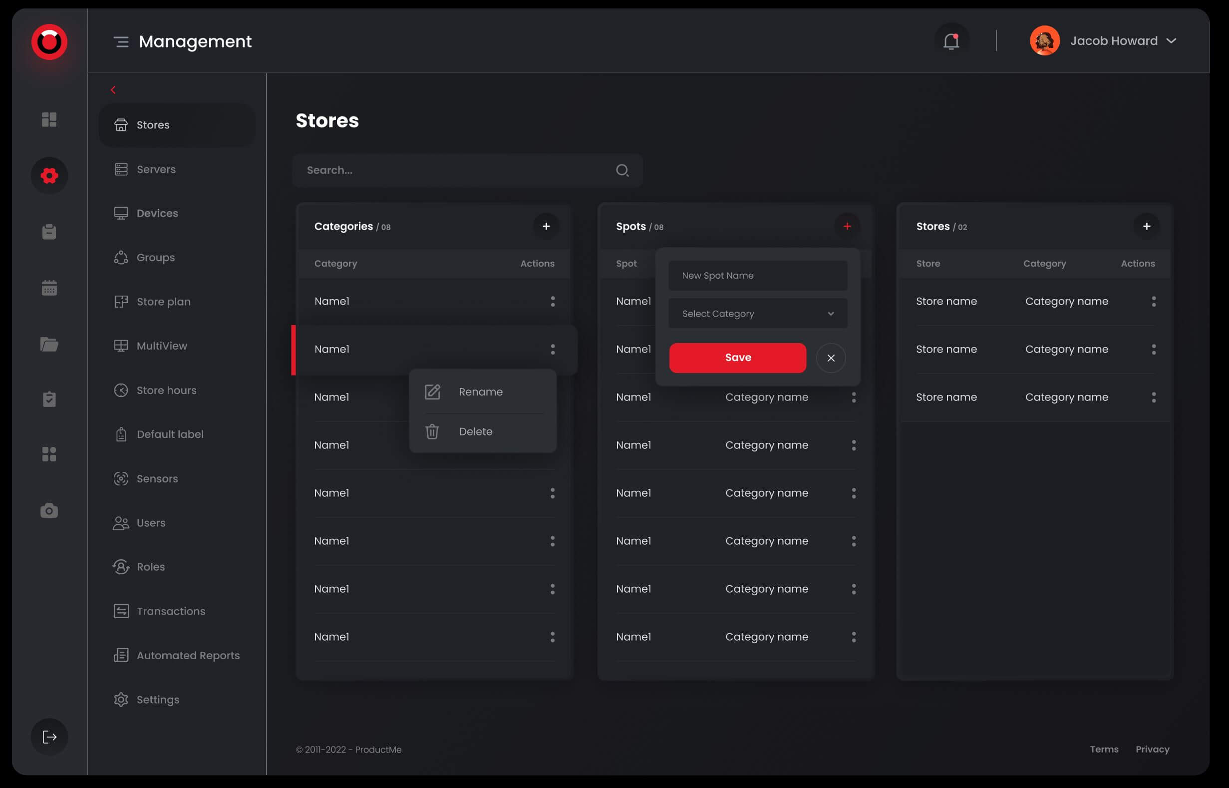
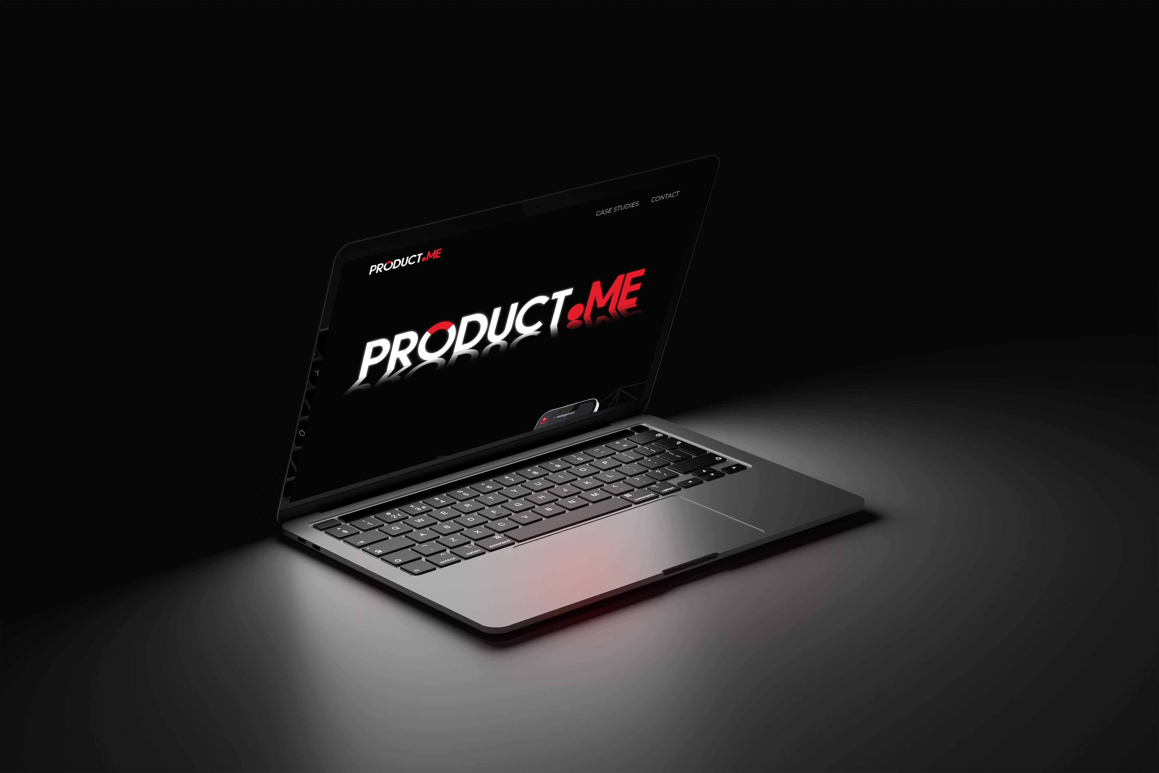
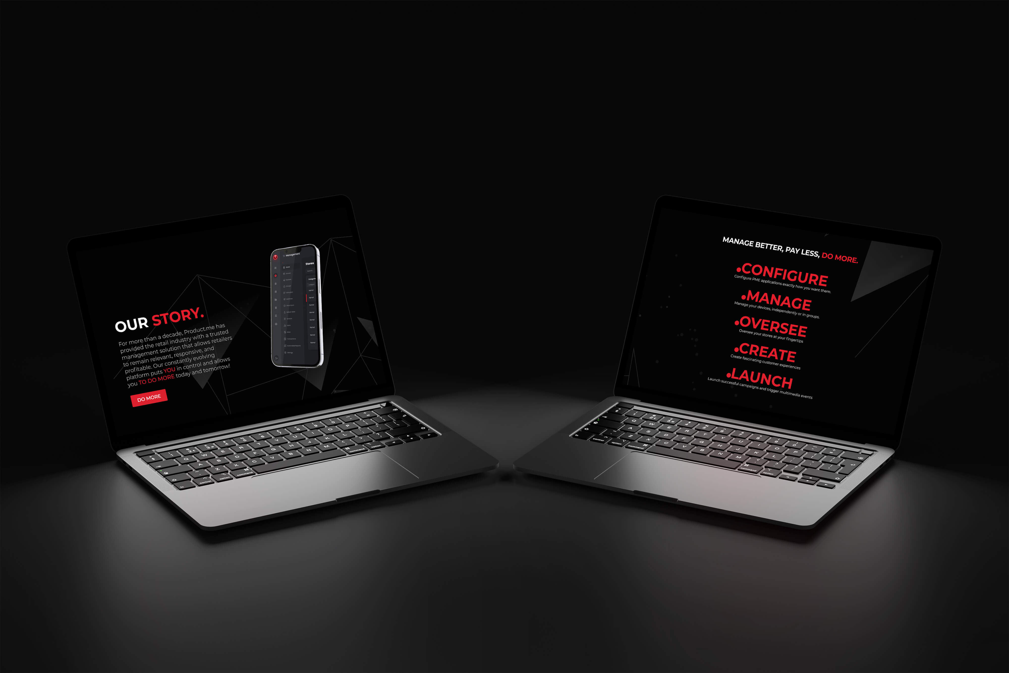
We then moved into the website redesign. Product.me needed a clearer message, a more structured visual approach, and a layout that supported conversions. We handled everything from Figma wireframes and prototypes to page design, typography, composition, illustrations, and branded components. Although we did not handle the coding or launch, our work delivered a clean, modern, and confident direction for their digital presence, helping them communicate their value more effectively to prospects and investors.
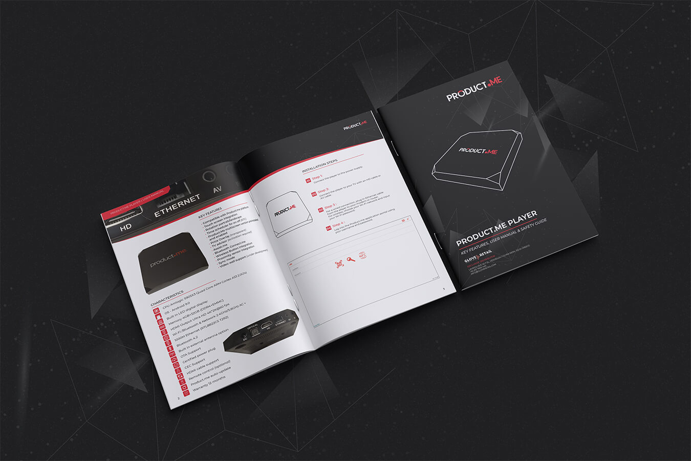
Alongside this, we developed a short six-page product manual. Even though it was a small piece, it required precision and clarity. We applied the new brand system to produce a clean, easy-to-follow document that reflected the professionalism expected in SaaS onboarding materials.
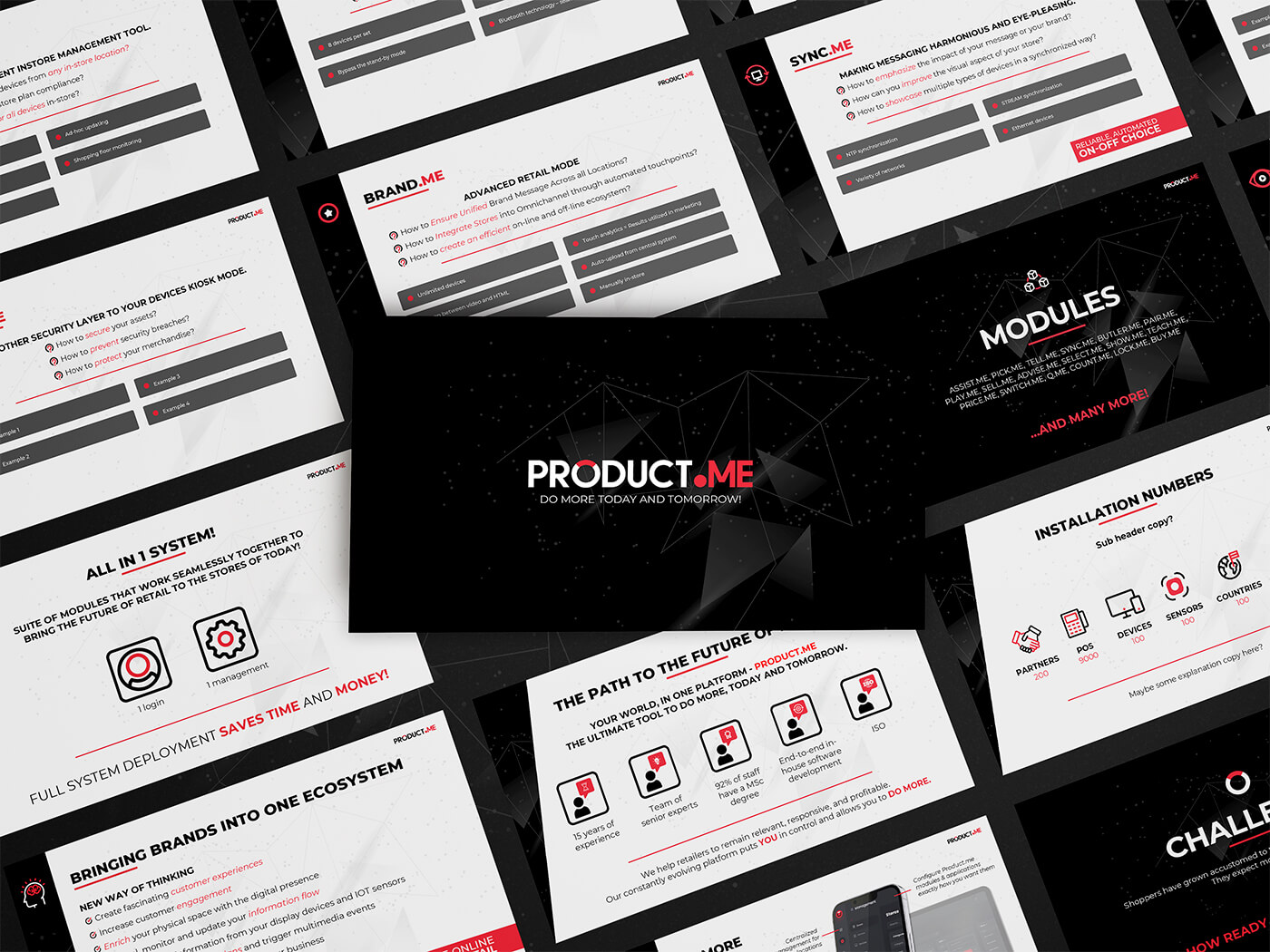
The most extensive deliverable was a 40-page PowerPoint for an upcoming sales initiative. This presentation needed to be visually compelling, consistent with the new identity, and easy for their team to use in both sales meetings and investor conversations. We built a comprehensive deck that blended strong graphic layout, structured storytelling, and brand consistency. The final result became one of their core sales tools.
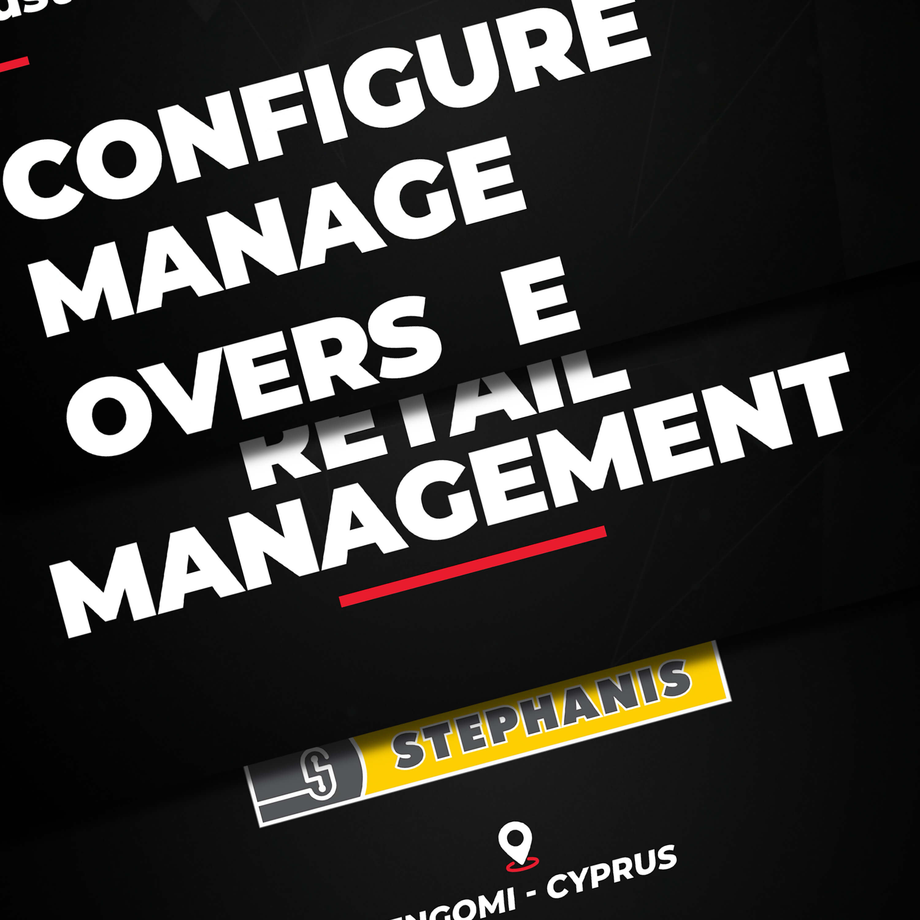
To support their marketing effort, we also produced a motion piece for a retail project involving the Stephanis electronics chain, the largest electronics retailer in Cyprus. The video showcased how Product.me helps manage retail operations, reduce labour costs, streamline workflows, and improve store efficiency. Motion content is one of the strongest ways to communicate complex SaaS value quickly, and this piece helped them explain their offering with clarity and energy.
Together, these deliverables formed a complete visual and communication ecosystem across print, digital, motion, and sales.
The refreshed identity moved Product.me from an inconsistent, unclear visual presence to a professional, structured brand that better matched the quality of their platform. The new guidelines created discipline and clarity across all touchpoints, making the brand easier to grow and maintain.
The redesigned website improved how they communicated their purpose, value, and product benefits. Stronger layouts, clearer messaging, and consistent branding contributed to better first impressions and stronger conversion potential.
The 40-page presentation gave the sales team a powerful asset for pitching, demonstrating value, and engaging with prospective partners. It created a more polished and credible presence during sales conversations.
The motion piece expanded their reach and provided a high-impact way to communicate complex SaaS advantages in simple terms, particularly in retail management and operational efficiency.
Overall, the project delivered consistency, trust-building assets, and a sharper brand foundation that supports long-term growth in a competitive SaaS and retail technology market.