


Moseley Road Baths is in the middle of a long term, multi phase restoration that carries huge cultural weight for the local community. The Baths exists today because residents, swimmers, volunteers, and local campaigners fought to keep it open for nearly two decades. Their continued effort eventually led to the creation of the Moseley Road Baths CIO, a coalition of community members and heritage organisations who are responsible for navigating the Baths toward a sustainable and ambitious future.
Alongside large scale structural work, the organisation is also responsible for communicating these changes to the public and to potential funders. That responsibility becomes more complex when the building is undergoing visible construction, when the public needs clarity about the future of the Baths, and when the organisation is actively preparing bids, tenders, and grant applications. Clear communication, strong visual language, and well structured materials become essential for maintaining trust, strengthening public understanding, and winning long term support.
Our role was split into two connected parts. First, we were commissioned to design hoarding boards for the exterior construction site. These boards needed to reflect the existing brand while helping passersby understand the scale and ambition of the Diving In redevelopment. They needed to feel welcoming, confident, and rooted in the Baths’ identity as a community led heritage site.
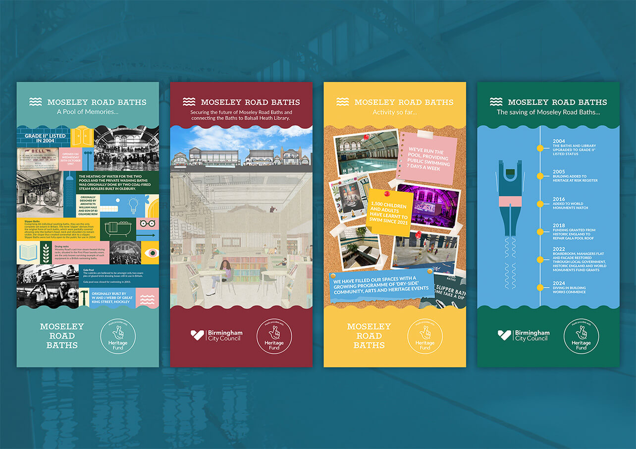
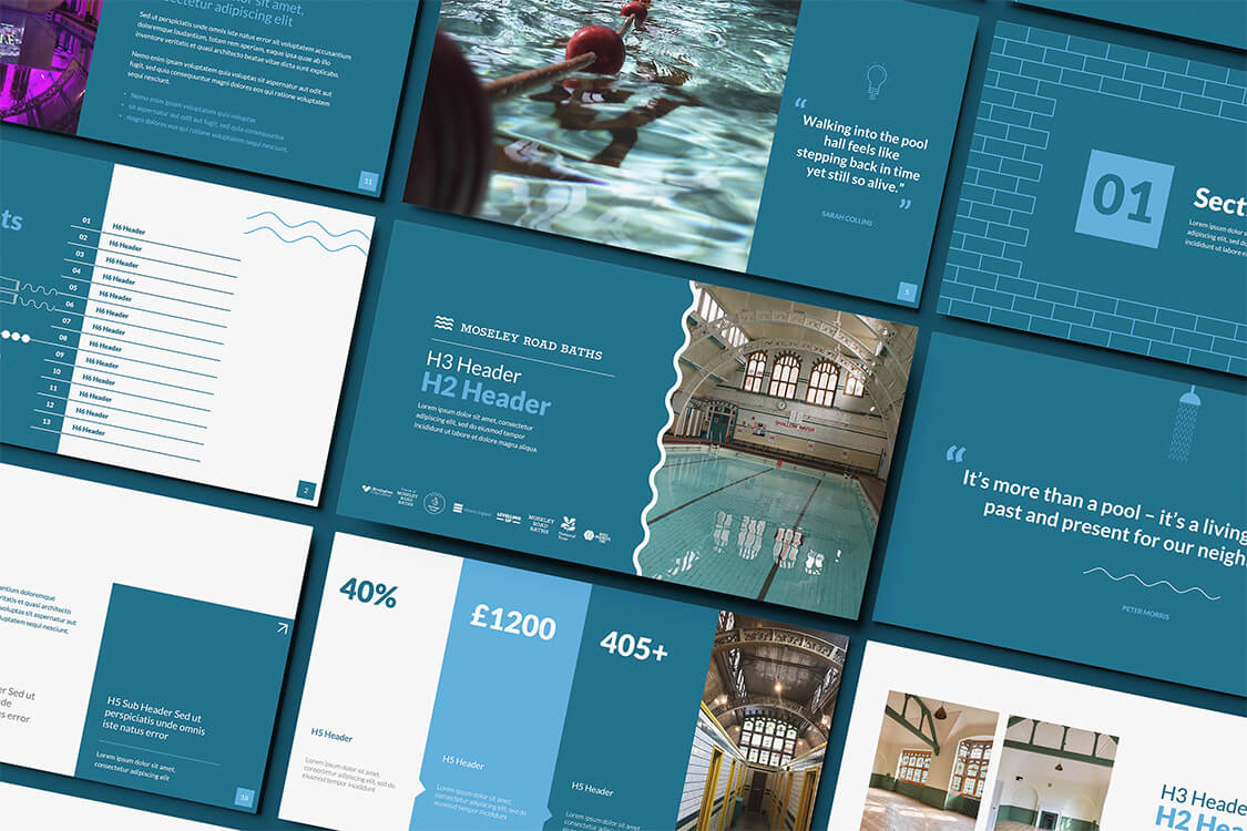
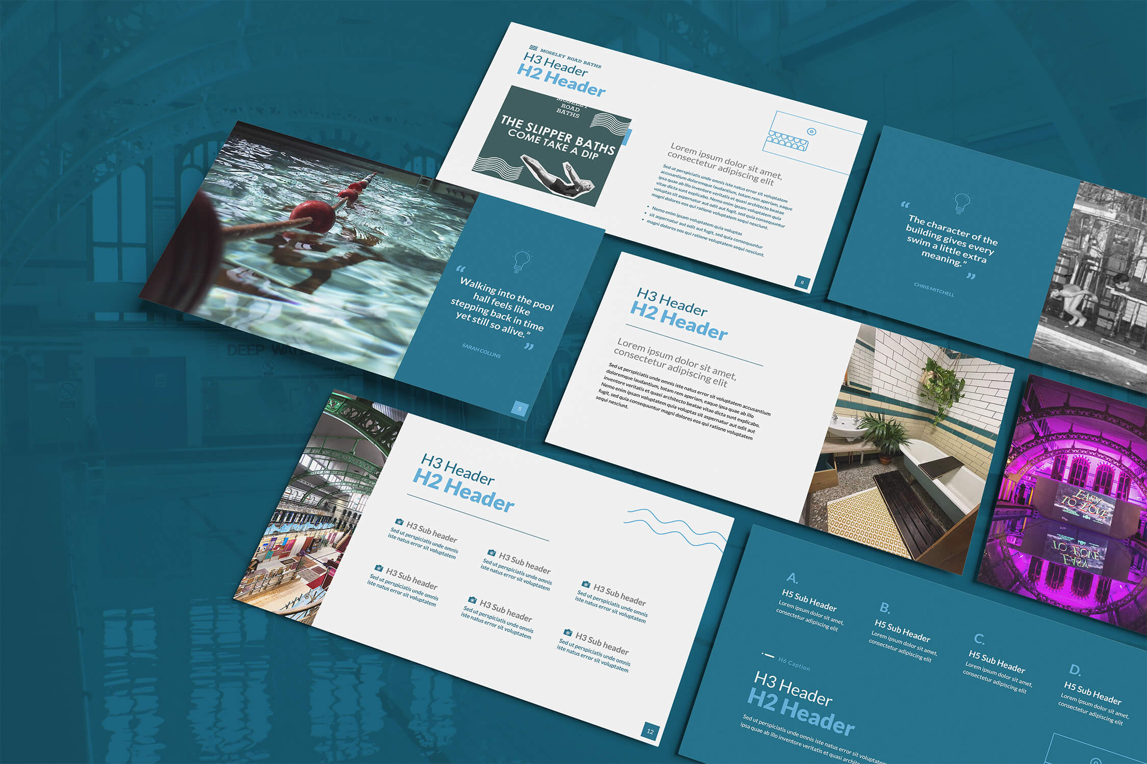
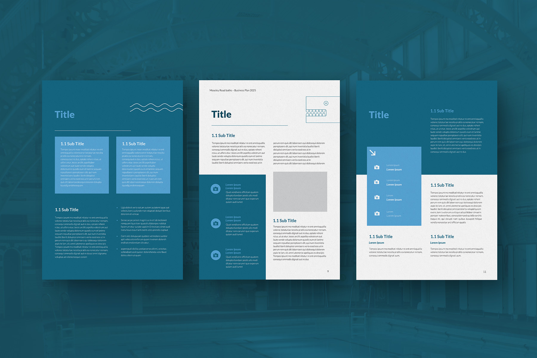
The second stage focused on creating a suite of high quality presentation materials. This included a full PowerPoint template with four colour themes, a complete master slide system, and a wide range of layout options covering quotes, articles, case studies, imagery, community stories, data points, charts, and key performance metrics. Alongside this sat a branded Word template for long form tender or planning documents, built to match the overall art direction while remaining flexible enough for internal use.
Together, these materials needed to support the CIO as they move through the next phase of funding applications and stakeholder communication. They also needed to carry enough structure and clarity to ensure anyone within the organisation could use them effectively.
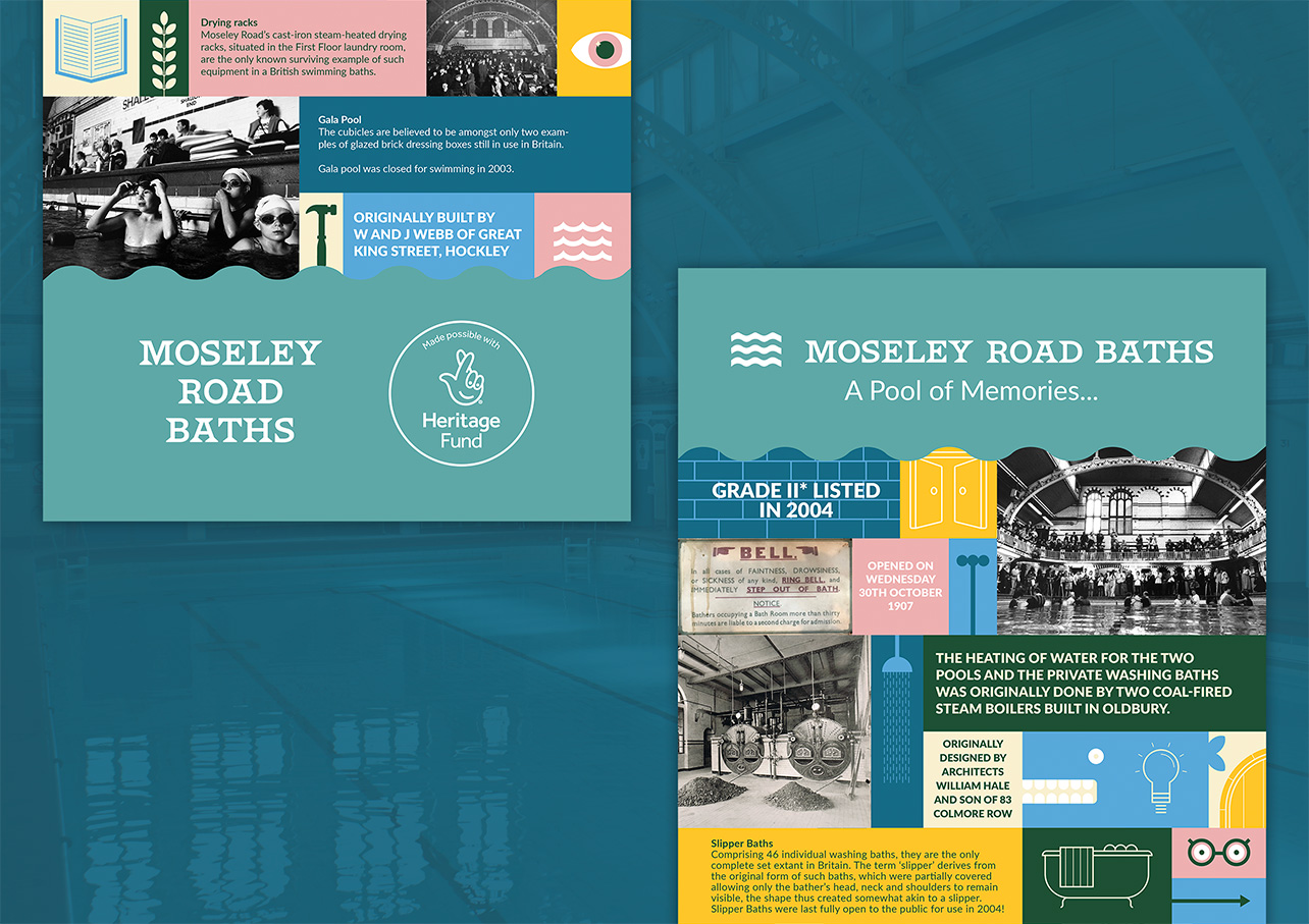


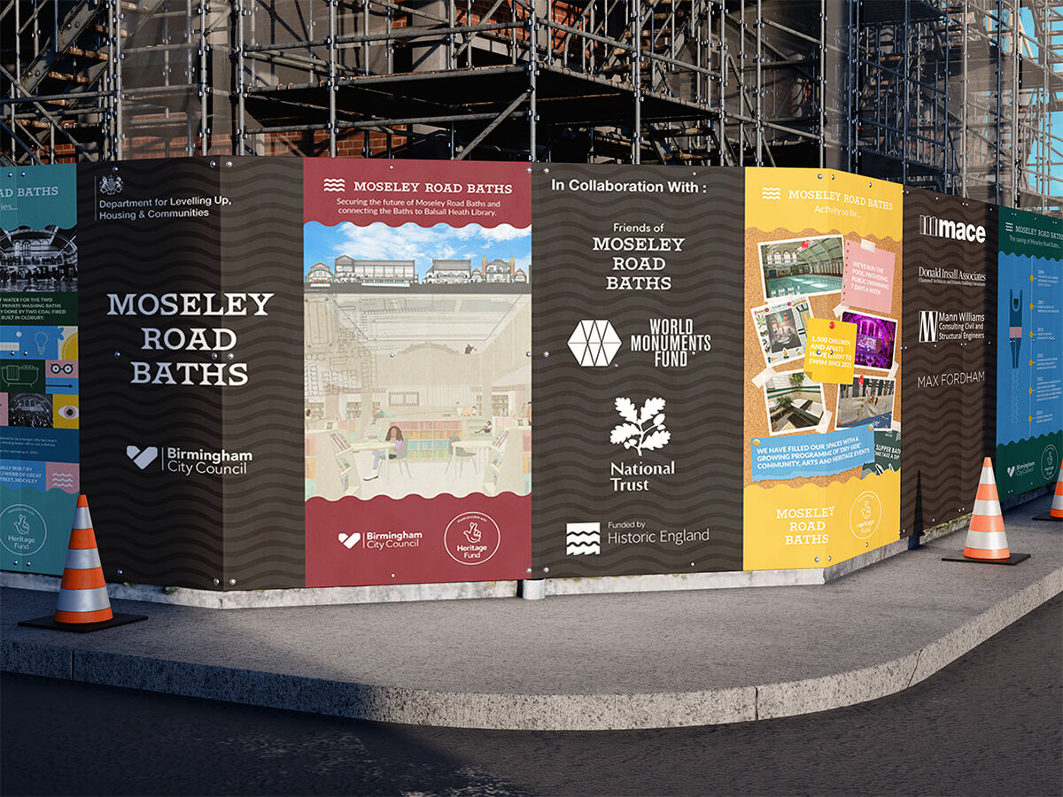
We began by reviewing their existing visual identity, pulling out elements that were strong and clarifying those that were inconsistent. The goal was not to reinvent the identity but to solidify it into a clearer framework that could scale across public facing and technical documents. For the hoarding boards, we paired core brand elements with archival photography, restoration imagery, and key narrative statements that explained the mission of the Diving In project. The boards were designed to make the community feel informed rather than distanced from the construction, turning the exterior of the site into a story about progress rather than disruption.
For the presentation materials, we approached the work as a blend of art direction and functional communication design. We established a structured slide system that balanced heritage with modern clarity, giving the organisation a professional toolkit suitable for funding bodies, council partners, and national heritage organisations. Four distinct colour themes offered flexibility across different audiences while maintaining a single visual language.
Master slides were built around real content types the CIO uses regularly. This included room for long narrative sections, side by side comparisons, historic timelines, community quotes, architectural images, and metric driven summaries. SVG assets were created for consistency across all internal and external documents, ensuring that the visual language stayed strong no matter who used the templates.
The Word template followed the same structure, giving the team a clean and flexible framework for long form reports, planning documents, and tender submissions.


The hoarding boards were approved immediately and received positive feedback from both the client and the community. They helped reshape the construction environment into a clear, story driven expression of progress, making the renovation feel tangible and intentional.
The presentation templates have since become core tools for upcoming bids and funding applications. By giving the organisation a strong visual system with flexible layouts, they are now better equipped to present their case clearly, confidently, and consistently. This improves how stakeholders perceive the CIO’s professionalism, strengthens the narrative behind the Diving In project, and increases their ability to secure future funding during a critical multi-year restoration.
.jpg)
.JPG)